Putting it on the MAP
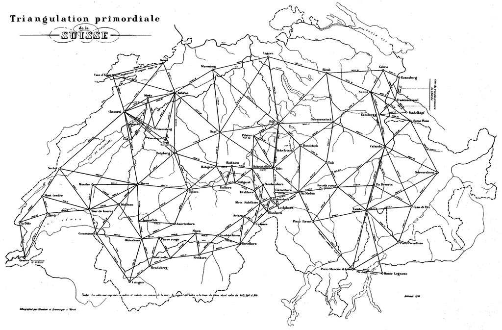
02. April 2019, NEXPO TeamCartographer Guillaume Henri Dufour produced the first accurate topographic map of Switzerland in the canton of Geneva between 1845 and 1864. The first Swiss national exhibition was held in 1883, and unsurprisingly, Dufour's “Topographic Map of Switzerland” was a star attraction.

Triangulation primordiale
NEXPO conceptualises an evolutionary, participatory and decentralised national exhibition format that sets it apart from past national exhibitions. Despite these profound differences, however, Switzerland's topography remains at the heart of the exhibition’s visual identity. What differentiates NEXPO's map from its predecessors?
Designers Anna Albisetti, Dominik Stucky, Emanuel Tschumi and Hanna Züllig felt that time had eroded the map's relevancy — an artistic reworking was in order.
The Challenge
The design team faced a significant challenge in aligning the artistic elements with the fundamental principles of NEXPO as a concept. The new map had to convey warmth and conviviality, and speak to Swiss diversity in the 21st-century.
The creative development process emphasised visual simplicity, and finding a way to accurately represent dynamics and decentralisation was crucial. The idea was to make borders disappear, and in doing so, show Switzerland's cantons, regions, languages and generations growing closer to one another. Furthermore, communicating the enduring legacy of the NEXPO effect was imperative. The implications of a national exhibition extend far beyond the temporal limits of the event itself; expos impact our cultural, technological and social development for decades after they close.
The Approach
Portraying borders dynamically, their movement an expression of tolerance and openness, was the only adequate solution. The animation even goes so far as to hint at the cession of territory. An algorithm controls the movement through a randomiser, and as such, the map is in a constant state of flux. A new map of Switzerland is produced every second.
When it came to choosing a palette, harmony was the predominant concern. The design team deliberately stayed away from the traditional colours of the cantonal coats of arms, and in doing so gave equal representation to each jurisdiction.
The animation’s rotating rectangles symbolise individual cantons without directly representing any one. These forms drew inspiration from Swiss hiking maps, where the regions are divided into rectangles and, depending on the section, show neighbouring countries as well.
NEXPO is entering unchartered territory, and this map represents the concept's endless potential for collaboration across borders, generations and cultures. Artistic development has only just begun — the coming months will see more unconventional, groundbreaking work portraying NEXPO's revolutionary new format for a national exhibition.
The Design Team:
Anna Albisetti runs a studio for visual design and teaches drawing and visual communication at Zurich University of the Arts.
Emanuel Tschumi has worked as a visual designer for 30 years, and after living in Zurich, Bern and Basel he is has moved back to Zurich once again.
Hanna Züllig manages a web studio and teaches creative coding at various universities. A trained art teacher with over 20 years of experience in web design, Hanna specialises in the interface between coding and visual representation
Dominik Stucky has many years of agency experience as a web designer/developer. Majoring in Interaction Design (ZHdK), his work demonstrates clear implementation, simple operation and easily relatable content.
Additional Content
NEXPO gets a new member
Glarus, the smallest cantonal capital in Switzerland, is now also a member of “NEXPO - the new Expo”.
Read article...Switzerland and its Limits
In Geneva, a roundtable by Samia Henni, a walk by Aline Mona Zuber and a newly produced film by Ayo Akingbade explore involvements in colonial pasts and postcolonial presents.
Read article...